Thanks to the Xbox Virtual Museum launched for the console’s 20th anniversary, Microsoft has revealed the origins of the Xbox 360 logo with a series of drawings.
On the occasion of the celebrations of Xbox 20th Anniversary, Microsoft has put online a virtual museum comprising many anecdotes. This is where we learned about the behind the scenes of Nintendo’s never-ending takeover. Among the revelations, Xbox gives details on the famous logo of its second console.
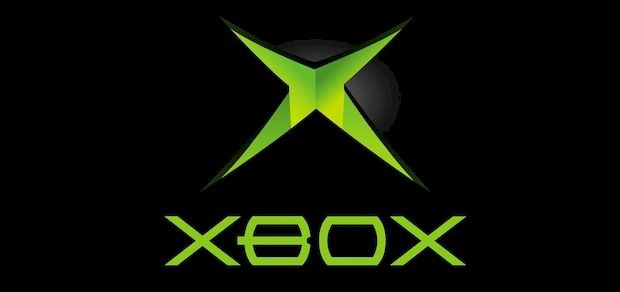
In reality, the symbol that adorned the Xbox 360 is just an unreleased sketch … of the Xbox logo. Simple, rather sober, and which had marked a generation, the first logo was an X in apple green on a black background, as you can see it again right here.
But among the various proposals of the Microsoft teams, there was also a 3D version, round or square, very close to what was then chosen for the second console, Xbox 360.
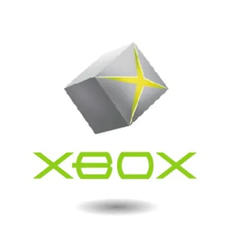

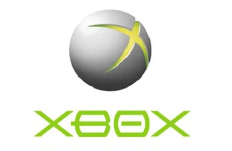
Finally, barely reworked, the final logo of the new console, four years later, was therefore greatly inspired, as you can see here. The character font, also emblematic of the first machine, was also ultimately modified.
A long round and in relief which will have finally lasted with the Xbox One and which will be put back in simple solid color with that of the Xbox series.
You can find other anecdotes on this link (provided you are on Microsoft’s Edge, because the latest versions of Chrome and Firefox are not all compatible), including the first rather ugly prototypes of the “Direct X Box”, the meaning of “alien” green or the other behind the scenes of the launches.
Source: www.purexbox.com


![[MàJ] Electronic Arts should be bought out in a very short time](https://videogamesrepublic.com/wp-content/uploads/2022/08/1661518157_MaJ-Electronic-Arts-should-be-bought-out-in-a-very-180x135.jpg)


