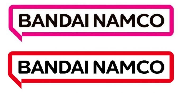
A few months after changing its graphic identity for a magenta-colored comic bubble, Bandai Namco changed its mind and offered yet another color to replace its orange logo.
We weren’t particularly hyped by the new logo from Bandai Namco, announced in October 2021. Too square, too simplistic and above all too magenta, a color that had no historical connection to the two Japanese companies. We weren’t the only ones not really convinced.
Guess the marketing guys finally heard the mixed feedback from the players. A few months after this change, the studio unveiled a new, very light rebranding, without even having had time to use the new branding. No madness that said, it’s only the color that changes, since the magenta becomes red.
The new graphic identity appeared in the financial statement presented to shareholders on Wednesday. The report gives the same explanation as at the time on the reason for this form. But this time, the mention of the magenta color has therefore disappeared, and the group explains their approach to finally adopting red:
For the color pattern, we sent questionnaires to employees around the world to collect their opinion on words that express images associated with the Group’s objectives. Among the words that were frequently mentioned, we selected candidate colors by scientific methods relating words to colors. From these candidates, we have selected a bright red color that creates an impression of enthusiasm, fun, activity and boldness.
We recall that the previous logo included red, yellow and orange, a mixture of the historic colors of the two Bandai and Namco studios. Below the new already old, and the new really new:


![[MàJ] Electronic Arts should be bought out in a very short time](https://videogamesrepublic.com/wp-content/uploads/2022/08/1661518157_MaJ-Electronic-Arts-should-be-bought-out-in-a-very-180x135.jpg)


